Project Duration
Core Objectives Solved
User-Tested & Validated
MuleSoft had a problem that most enterprise companies share — years of valuable technical content locked inside PDFs. Long whitepapers on microservices, API patterns, integration architecture. Genuinely useful material for developers. Almost impossible to actually read.
The brief was deceptively simple: turn PDFs into web experiences. The reality was considerably more complex — the solution needed to simultaneously solve for SEO discoverability, user engagement, content analytics tracking, lead generation through form gates, and MuleSoft's ability to cross-promote their products throughout the reading experience.
I worked directly with MuleSoft's Product Manager and an Analytics Developer — a rare collaboration that meant design decisions were validated with real tracking data, not just intuition.
Safal AI is built around three core AI tools, each addressing a specific knowledge problem the firm faces daily:

PDFs are invisible to search engines. Years of valuable technical content was generating zero organic traffic because it couldn't be indexed. Converting to web pages meant every section became searchable, linkable, and shareable.

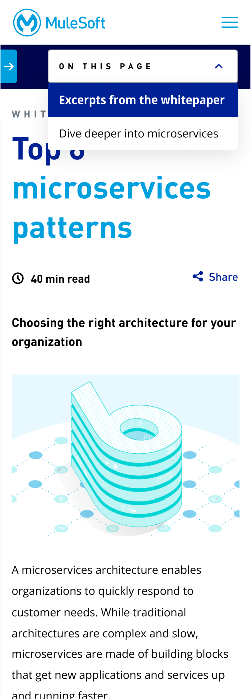
A 40-minute read as a continuous PDF is overwhelming. The same content broken into structured, navigable sections with clear hierarchy, read time indicators, and bite-sized pages becomes genuinely approachable. Developers could jump to exactly the section relevant to them.

PDFs tell you nothing about how people engage with your content. The web experience was designed with a comprehensive analytics layer — tracking form fills, time on page, pages clicked through, share button interactions, and "Ask an Expert" conversions. For the first time, MuleSoft could understand how developers actually consumed their content.
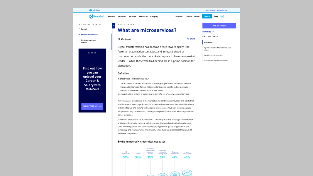
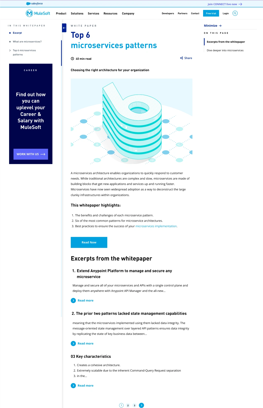
The solution was a three-column web experience modelled after MuleSoft's existing design language — studied, validated with their design lead, and built to feel native to their site.
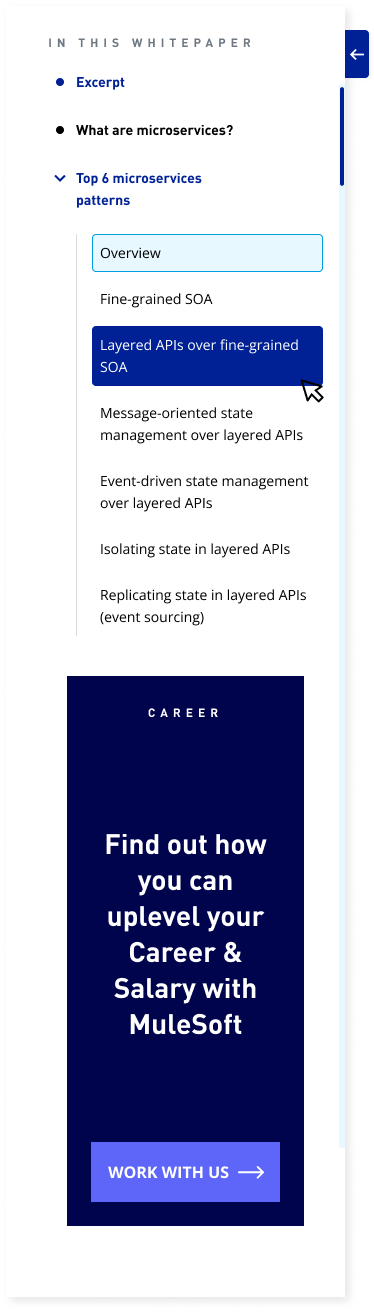
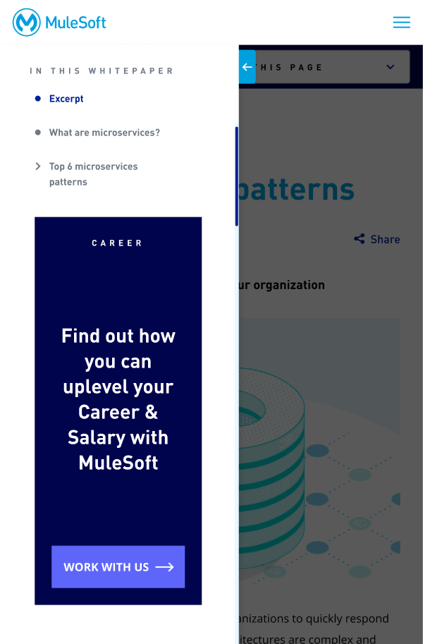
Left Rail — Navigation
A collapsible tree structure showing the full document hierarchy — all sections and subsections visible at a glance. Users could see the entire content structure before reading a single word. Expanded by default on first visit so users immediately understood what they were getting into. Each section clickable, taking users directly to that page.
Content Area — Centre
Each PDF section became its own web page — with a clear H1 title, read time indicator, and content formatted following MuleSoft's blog typography and image treatment. Pagination at the bottom connected pages sequentially. The visual and information load of a 40-minute PDF was reduced to digestible, focused sections.
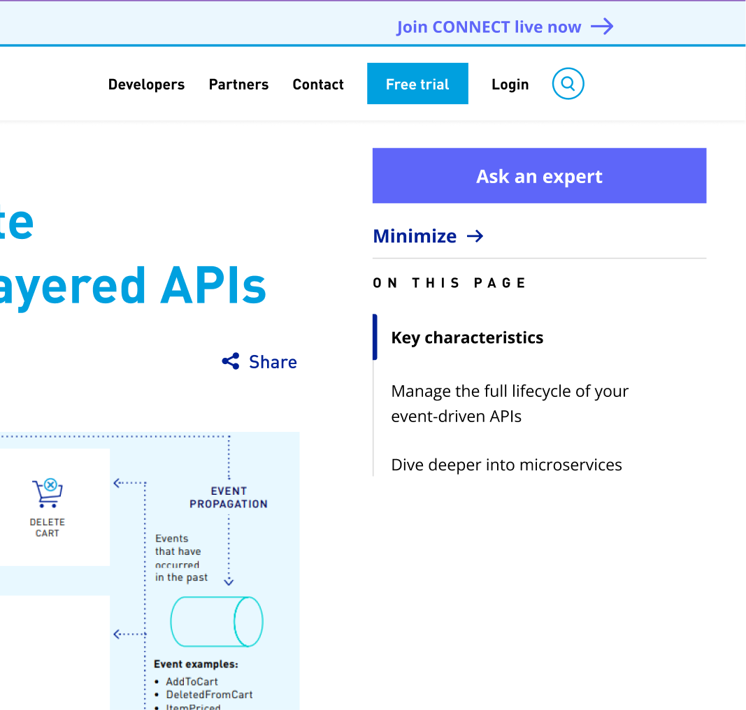
Right Rail — Context
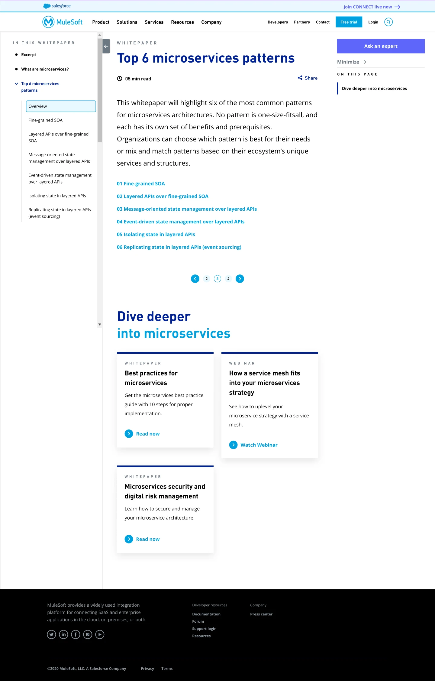
Related content tiles, cross-promotional MuleSoft products, and an "Ask an Expert" CTA. This was the business value layer — every reading session became an opportunity to surface relevant products and capture leads from an already-engaged audience.
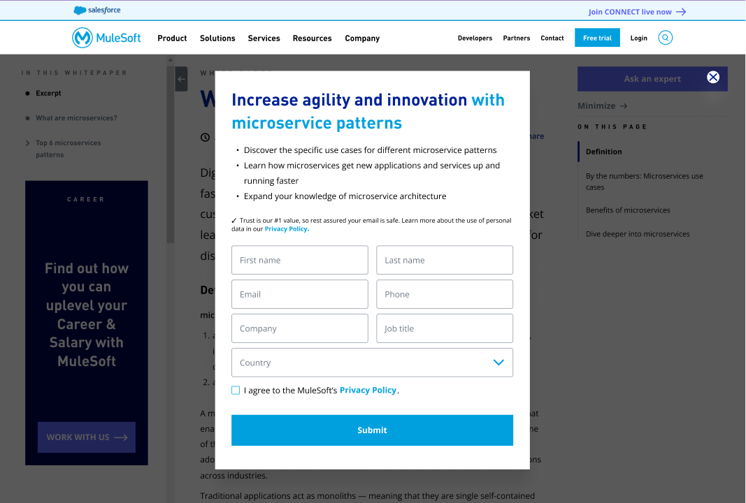
One of the most technically complex design decisions was the form gate — a lead capture mechanism that appeared as a popup whenever a new user arrived, regardless of which page they landed on.
The system needed to:
I designed every state: form popup, filled state, error states, success state, and the ungated experience for returning users. The result was a lead generation mechanism that felt frictionless — not a wall, but a natural part of entering the content space.
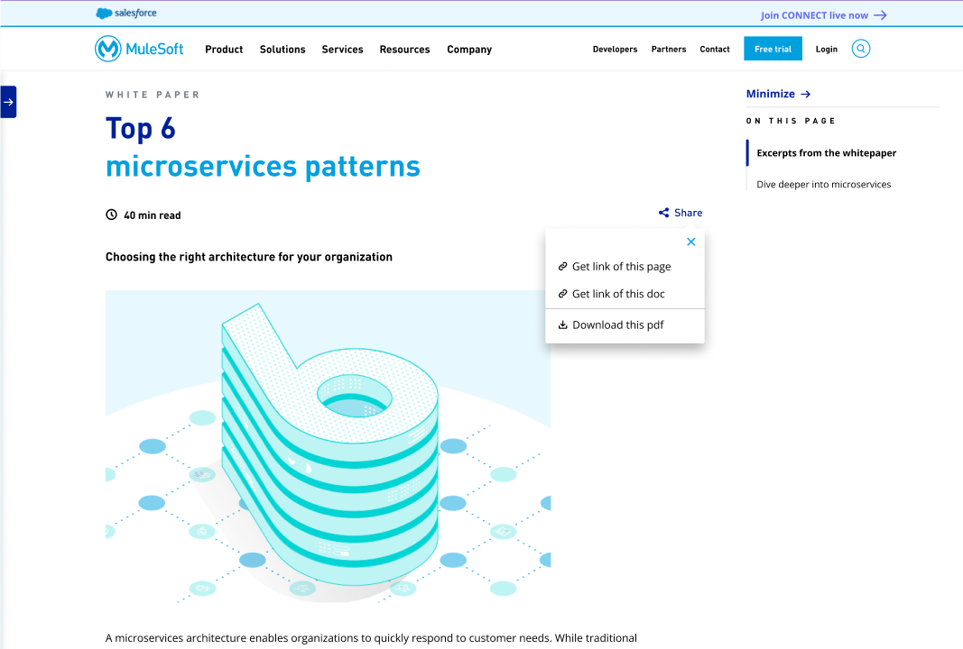
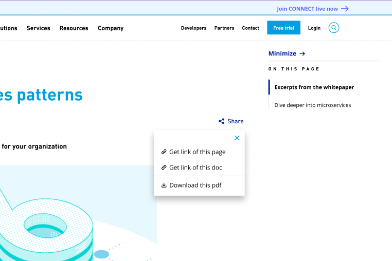
The share system was designed with three distinct options depending on context:
On the Landing Page:
On Content Pages:
This distinction matters — a developer sharing a specific section with a colleague needs a different link than someone sharing the whole document. Small decision, significant usability improvement.
The project tested two content lengths: a long-form whitepaper and a short-form document. Each rendered differently in the web experience — the navigation depth, pagination structure, and content hierarchy adapted to the length of the source material. This wasn't one template applied universally — it was a system flexible enough to handle different content structures gracefully.
Landing page — full three-column layout with left rail expanded
Left rail — showing full tree navigation structure
Content page — showing H1, read time, content, pagination
Form gate popup — default state
Right rail — related content and Ask an Expert CTA
Share button — expanded options
Mobile view
Tablet View
The web experience was built, tested by the Analytics Developer, and validated — proving that developers engaged meaningfully with the structured web content versus the original PDF format. The project was paused when Salesforce completed its acquisition of MuleSoft and subsequent layoffs hit the team.
The work was solid enough that the Product Manager — later brought me on as a freelance designer for his next venture. That's the outcome that matters most.
Project paused post-Salesforce acquisition. Design validated through user testing.
Contact Me