RedCrackle is a full-service digital transformation agency — serving Fortune 500 companies and startups across design transformation, web and mobile development, e-commerce, AI & ML, analytics, and interactive web experiences. Founded in 2012, the company had grown significantly but its visual identity hadn't kept pace.
My job: create a complete brand identity — wordmark, color palette, visual system — and design the full website from scratch. Everything needed to feel modern, sleek, and impactful. Not stock. Not generic agency.
The challenge wasn't just design — it was navigating two completely opposing creative directions within the organization.
Two stakeholders. Two completely opposite visions.
One wanted bold, bright, popping visuals — high energy, expressive, loud. The other wanted minimal service design — clean, quiet, nothing tacky. Neither was wrong. Both were right for different reasons.
My solution: popping colors, minimal design. Take the energy and confidence of the first vision. Apply it with the restraint and sophistication of the second. The result is a brand that stands out without shouting — bold enough to be memorable, clean enough to feel credible.
This is the design decision I'm most proud of on this project. It required understanding what both stakeholders actually wanted beneath their stated preferences — and finding the intersection.
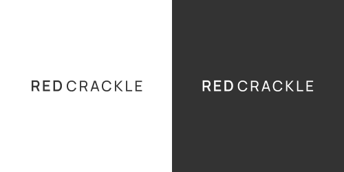
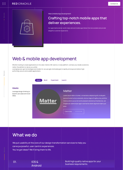
A clean, modern wordmark — not a logo mark or icon, just type. The choice was deliberate: a wordmark forces the name to do the work, which is appropriate for a company whose reputation is built on what they do, not on a symbol. Modern, sleek, immediately readable.
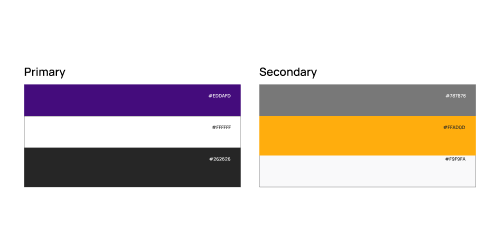
Bold, confident colors that pop — applied with restraint across clean layouts. The palette gives RedCrackle visual energy without sacrificing the professional credibility an agency needs when pitching to Fortune 500 clients.
Typography, spacing, and visual hierarchy all follow the same principle: maximum impact, minimum noise.
Lorem ipsum dolor sit amet consectetur. VeThe RedCrackle website needed to do two things simultaneously — communicate what the agency does with enough clarity that a new visitor understands immediately, and feel impressive enough that the same visitor wants to work with them.
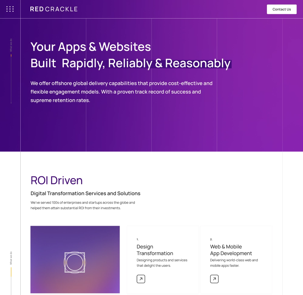
Services — the core of the site Seven service areas, each with its own page:
Each service page follows a consistent structure — the problem it solves, RedCrackle's approach, and case study references. The navigation is structured so users can move between services without losing context.
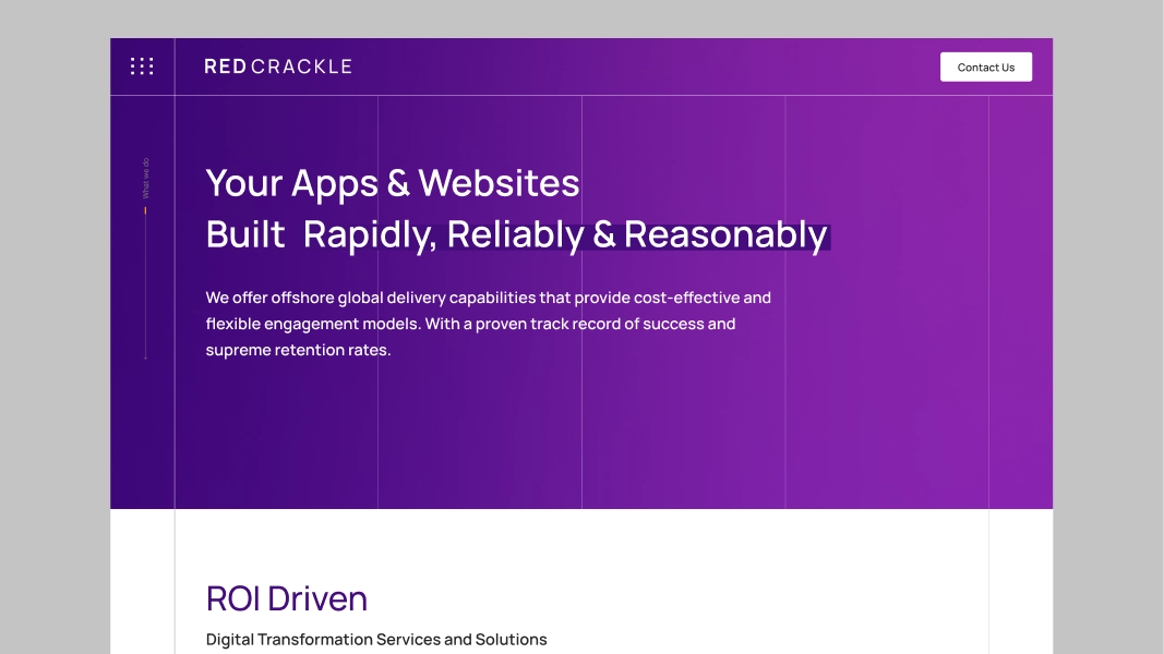
The homepage was designed with interaction and animation in mind — a dynamic entry that communicates momentum. The live site has the design correct; the animations are partially implemented. The design intent was a site that felt alive on first load.
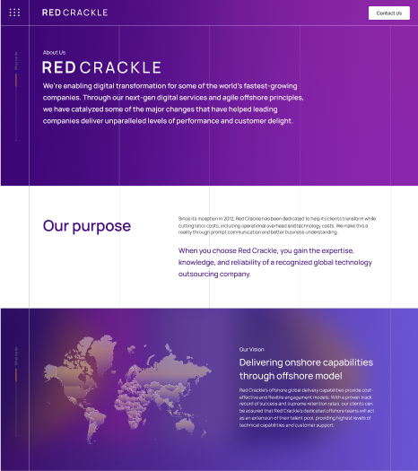
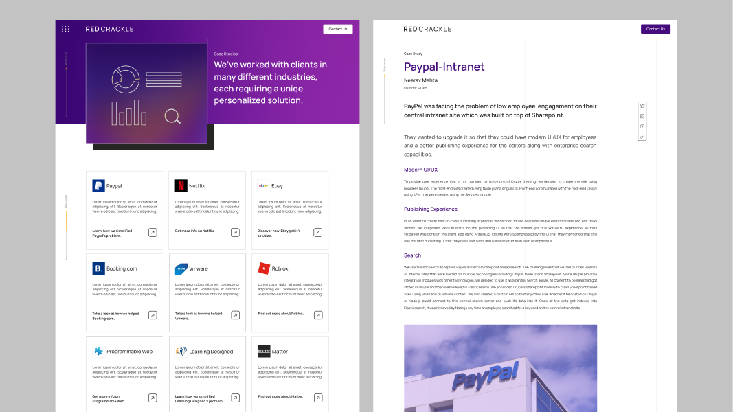
RedCrackle's story — from a Drupal-focused startup in 2012 to a global digital transformation agency with clients including PayPal, eBay, MuleSoft, and others. The About page balances the founder's story with the team's expertise.
A portfolio section showcasing client work — the evidence behind the agency's claims. Designed to be browsable and filterable by service type.
Wordmark
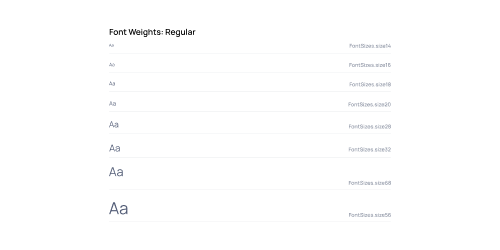
Color palette
Homepage
Service page
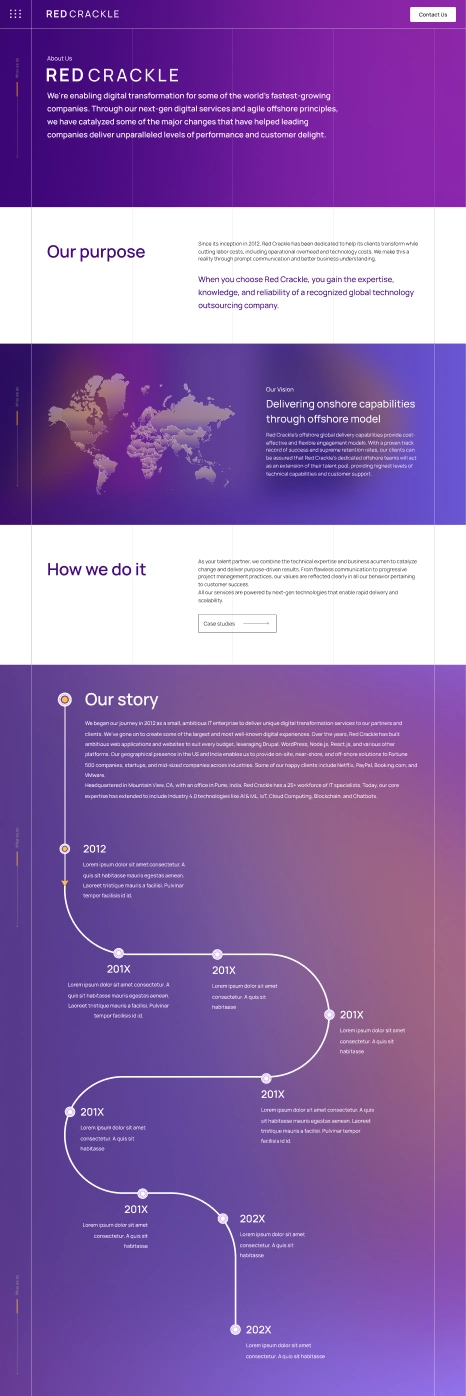
About Us
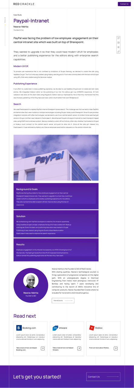
Case Studies
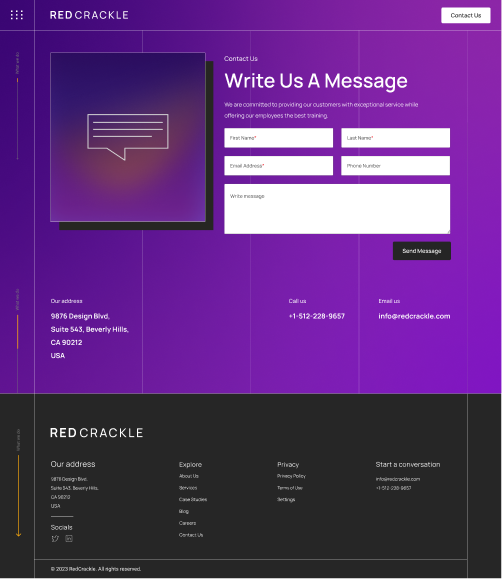
Contact page
The RedCrackle brand identity and website are live at redcrackle.com — actively used to pitch and win clients including Fortune 500 companies. The visual system is in daily use across the agency's communications.
Completed in approximately four months alongside client project work.
Contact Me